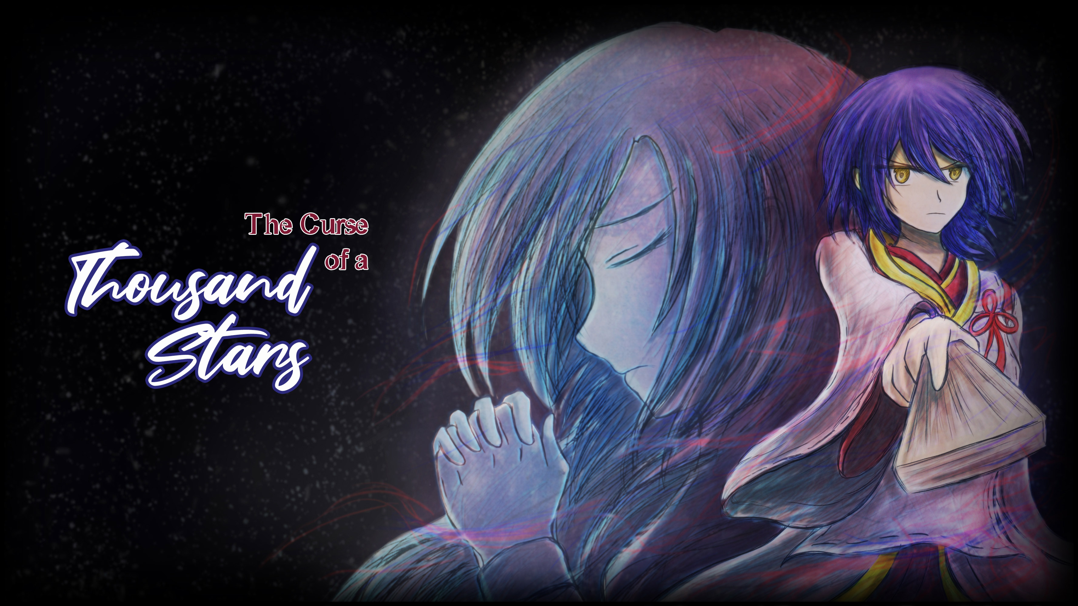
The Curse of a Thousand Stars
A downloadable game for Windows
Length: 30 minutes.
Prototype Features:
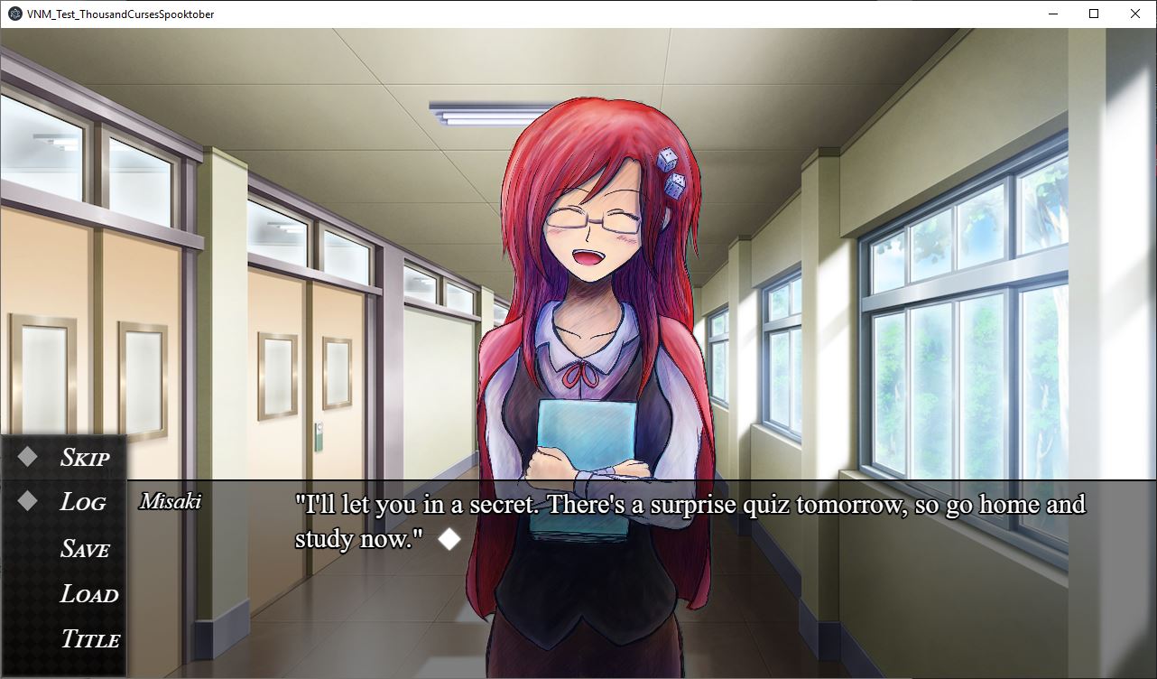
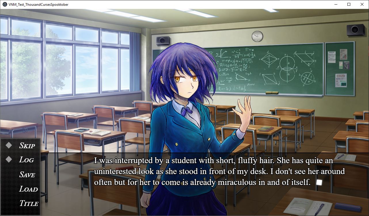
- Made on the Visual Novel Maker Engine
- Beautiful art from RPG217
- No gore
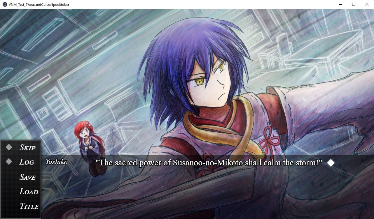
- Contains action
Credits:
https://www.instagram.com/rayhanpg/ | https://www.deviantart.com/rpg217
https://www.dafont.com/times-new-arial.font?l[]=10&l[]=1 (title font)
https://www.dafont.com/fair-prosper.font?l[]=10&l[]=1 (title font)
Please leave your feedback for what I have! I will continue to work on the game for the next year and any comments are appreciated.
Thank you for Spooktober 5th Jam for this opportunity!
Download
Comments
Log in with itch.io to leave a comment.
Very text heavy making it feel a bit more like reading a novel/light novel when compared to how visual novels are usually written but I still really liked it, the setup was interesting and had a very anime feel to it(in a good way haha) and I was wanting to know more at the end. 👍
I think the story, ideas, and characters are really interesting! I can tell there's some depth to be found in the lore, character backstories, and the action sequences were well done. The story itself has a lot of promise.
Now aside from some of the more obvious grammar issues and a lack of audio ...
My main criticism in terms of writing is I feel this reads more like a novel than a visual novel. When writing a vn script, I find it's best to think of it more like a play script than a book full of pages and pages of narrative text. Generally speaking, it's best to keep the dialogue exchanges and character interactions longer and the narrative explanations shorter, especially when you don't have any visuals to pair along with the narration. If all the reader has to look at is a black screen or static background and paragraph after paragraph of text, it can get a little tedious, breaking the reader's immersion into the story.
As for the visuals, I think the sprites and CGs by themselves are cute, expressive, and nicely drawn. However, the sprites clash with the backgrounds. The differences in art style is too apparent and don't mesh well together. I think the special visual effects were a nice touch, though some of the flashing ones were a little disorienting. Personally, I was fine, but someone who's sensitive to flashing lights/patterns might have trouble with it. I'd advise maybe consider putting a warning about somewhere? Just a friendly suggestion.
Overall, I think this is a good effort and, criticisms aside, I still enjoyed it. I wish you the best on continuing this and future projects! :)
Thank you so much! I am working on completing the project for its own release next year :D I already heard a few people suggesting I also write too much like a novel (I cam from the fanfiction area so it's a habit). Everything you wrote are very useful and I'm glad you were able to enjoy the little of what I managed to finish c: